|
Science Fiction and Fantasy Association of New Zealand |
||

Archived Designs for Trophy and Logo
Note: All of these designs are (at the present time) ideas and jumping off points.
Following are designs that have been suggested for the Sir Julius Vogel Awards and a logo for SFFANZ.
Jump to: SFFANZ Logo Designs
Sir Julius Vogel Awards.
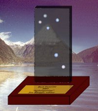
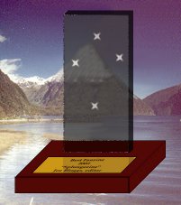
James Dignan |
|
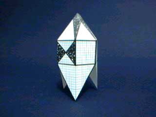
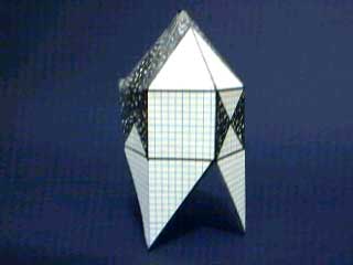
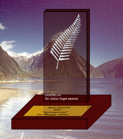 Trophy-JD1 Trophy-JD1 |
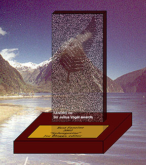 Trophy-JD2 Trophy-JD2 |
Kelly Buchanan (modified from a design by James Dignan) |
|
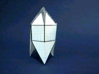
 Trophy-KB1 Trophy-KB1 |
 Trophy-KB2 Trophy-KB2 |
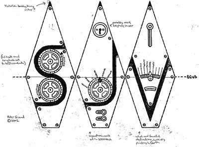
Peter Friend |
|
   Trophy-PF1 Trophy-PF1 |
|
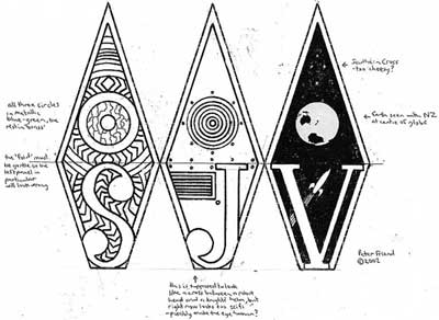
| Hmm, the letters S, J and V (as in
Sir Julius Vogel) don't lend themselves awfully well to a logo or
design, as they don't want to fit into each other nicely and are
rather different shapes. And just a J by itself seems a bit
lonely.
So, I thought, why not a logo which itself forms the trophy? After some fiddling with graph paper and tape and I came up with the attached hexagonal thingy, which looks like a S, J or V depending on which angle you look at it from. Now obviously this isn't the finished design, just a rough draft. I'd see the actual trophy being in silver (silver spray painted resin, that is), and looking like it was engraved with various scientific and magical symbols, with a Leonardo Da Vinci sort of look, as though it was a mysterious piece of Rennaissance technology. And it would be on a base, where the winners details etc would be attached on a wee plaque. Any comments on the general design? If there's some enthusiasm, I'll try a somewhat more detailed design (woohoo! - where's the tin foil and the modelling clay?) |
|
Norman Cates - Peter Friend |
|
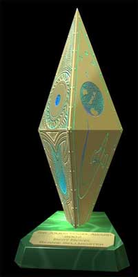
Trophy-NCPF4 |
|
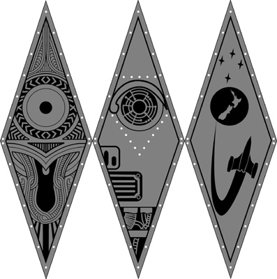
Trophy-NCPF4aTo the right is a modification of the below line design, based on comments from various people on the list. It's a combination of the comments from the list. It keeps the circular motifs in line, and harks back to the original design as well... |
 |
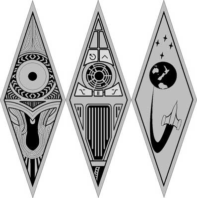
| Below are detailed renderings of the latest design for the trophy. | Below are the designs that would be used to etch the trophy. |
  |
 |
| And thanks to Creative New Zealand, Te Papa and Te Maori for their input on this design. | |
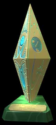
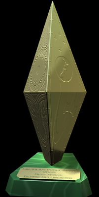
Trophy-NCPF3 |
|
   |
|
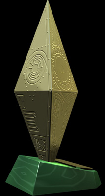
Trophy-NCPF2 |
|
   |
|
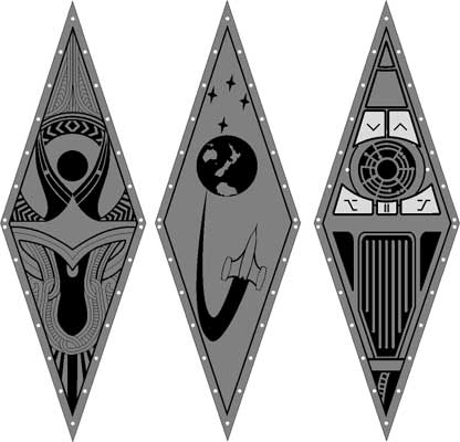
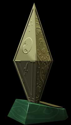
| Above are renderings of a modification of the trophy design. to the right are the panels which were used to create the etching. | |
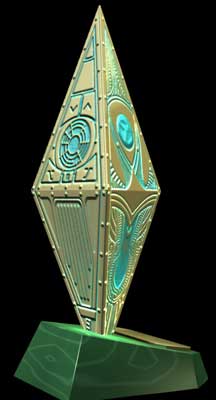
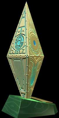
Trophy-NCPF1 |
|
  Trophy-NCPF1 Trophy-NCPF1 |
|
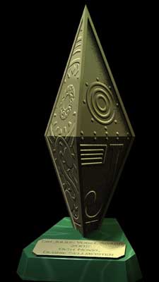
| This design is a rendering of designs drawn by Peter,
on a trophy shape by Norman.
Most people so far seem to like it. Except the general concensus seems to be to remove the letters from the etching. This would be produced by etching the design into copper sheets, then joining them together and molding them in silicone in order to cast multiple trophies. |
|
 |
 |
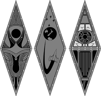
| This is one of Peters designs for the etching. This is the one used on the rendered trophy above. | This was an alternative design by Peter. |
SFFANZ Logo Designs
James Dignan |
|
Peter Friend |
|
 Logo-PF1 Logo-PF1 |
|
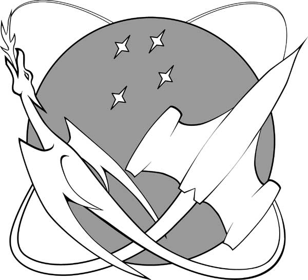
Norman Cates |
|
Logo-NC1 |
 |
| The particulars of this logo have been discussed.
One suggestion was to put a Kiwi on the spaceship. My opinion is that the kiwi would simply clutter the image. The kiwi is a great NZ icon, but inappropriate in this design. (This variation of the design is shown below.) Putting the stars further apart so they surround the spaceship was tried by me, but in my opinion, it reduces the significance of the Southern Cross |
Variation on the above. Probably more suitable for making a Shirt or embroidered patch. |
 |
|
| The above is my take on a possible use of the above logo in a letterhead. This logo at this size still works. | |
Modification as suggested by Struan Judd, Frank Pitt and others. |
|
 |
|
| There has been much discussion about logo design and how we should be creating the logo. The virtues of simplicity have been brought up and explained. With that in mind a number of people have produced drawings to represent a simple fusion of icons from SF and Fantasy, and the acronym SFFANZ. This fusion could be useful for situations where a full logo like the one above would be inappropriate. | |
New logo Design by Norman Cates / Peter Friend - NCPF 2 |
|
| This design is more dynamic than the above one. It seems to scale well. And with a few modifications it will also work on black. | |
 |
 |
| Below is a possible set up for a letter head | |
 |
|
 |
 |
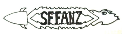
James Dignan |
|
Steven Rose |
|
 Logo-SR1 Logo-SR1 |
|
Peter Friend |
|
 Logo-PF2 Logo-PF2 |
|
 Logo-PF3 Logo-PF3 |
|
 Logo-PF4 Logo-PF4 |
|